
A prospective client lands on your website at 9:30 p.m., after a difficult day. They have been carrying the same concern for months. They are interested enough to search, but not yet confident enough to call.
They read your home page. Then your service page. Then maybe your About page. They open your booking link, hesitate, and close the tab.
Nothing about that moment means your practice is not right for them. It often means the path from curiosity to first session asked them to make too many decisions without enough reassurance.
That is what a client journey map helps you see.
A client journey is not a cold sales funnel. It is the sequence of questions, emotions, and actions a person moves through as they decide whether to trust your practice. When you map it well, you can remove unnecessary friction while keeping the experience human, clear, and aligned with the care you provide.
Why a Strong Website Still Loses Ready-to-Book Clients
Many wellness websites are designed around what the practitioner wants to say. They explain a philosophy, list services, share credentials, and include a “Book Now” button.
Those elements matter. But the client’s mind is usually moving through a different sequence:
“Am I in the right place?”
“Do they understand what I am dealing with?”
“Can I trust this process?”
“What will the first appointment be like?”
“What do I need to do next?”
If your website answers only the first question, a visitor may leave even when they genuinely need your support. That is why a website that looks good but does not bring clients is often missing a journey—not simply more traffic.
The Five Stages Between a First Click and a First Session
You do not need a complicated software diagram to map the experience. Start with five moments that nearly every practice needs to support.
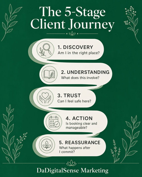
- Discovery: “Can this person help with what I need?”
A potential client may arrive from Google, a referral, social media, or an AI-generated answer. Their first need is recognition.
Your homepage and service pages should state who you help, what you offer, and where you serve in language a client would use. Avoid making someone decode broad statements such as “supporting your wellness journey.” Replace them with clear descriptions of the concerns, populations, or goals your work is built to support.
This does not mean making promises you cannot substantiate. It means helping the right person quickly see that they are in the right place.
- Understanding: “What does working with you actually involve?”
Once someone sees a possible fit, they need a simple explanation of your approach.
This is the moment for a service page that describes what happens in a session, how your approach differs from a familiar alternative, how long an appointment lasts, and whether there are practical steps before booking. You are not trying to answer every question. You are trying to remove the uncertainty that prevents someone from asking the next one.
A well-organized FAQ can help here. So can short “What to Expect” sections, clear pricing or insurance information when appropriate, and a visible statement about whether you offer discovery calls.
- Trust: “Do I feel safe taking this step?”
In wellness care, trust is rarely created by a polished design alone. People look for evidence that you are credible, attentive, and real.
That evidence can include recent reviews, a clear practitioner bio, professional credentials explained in plain language, and messaging that reflects the person’s actual concerns. It also includes the small operational signals: an up-to-date contact page, a working booking link, a prompt response, and a website that is not asking them to guess what happens next.
Trust grows when the digital experience feels like the care they hope to receive in person.
- Action: “Can I book without creating more work for myself?”
This is where many journeys become unnecessarily difficult. A client clicks “Book Now” and finds an unfamiliar calendar, no appointment details, no clear price, or a form with more questions than they are comfortable answering before speaking to anyone.
Audit the booking path from a client’s point of view. Can someone move from the relevant service page to the appropriate booking option without opening several new tabs? Does the call to action describe the next step clearly? Are there any surprise requirements?
Not every practice will use the same booking process. The principle is simply to make the next action proportionate to the client’s readiness. Someone who wants a full appointment should be able to book one. Someone who needs a fit conversation should be able to request that without navigating a maze.
- Reassurance: “What happens after I commit?”
The client journey does not end when the calendar confirmation appears. For many people, that is when uncertainty peaks.
A short confirmation email and text message can reduce no-shows and pre-session anxiety by covering basics: where to go or how to join, what to bring, whether there is paperwork, what the session duration is, and how to contact the practice with a practical question.
This is where your client follow-up system becomes part of conversion strategy. A timely, calm message does not feel like marketing. It feels like being expected.
Map the Emotional Friction, Not Just the Website Pages
A traditional funnel map may show pages, forms, and emails. That is useful, but it is incomplete for a holistic practice.
Add the emotional questions beside each stage.
| Journey Stage | What the Client Needs | Practical Website or System Response |
|---|---|---|
| Discovery | Recognition | Clear headline, location, and service language |
| Understanding | Context | Plain-language service details and “What to Expect” content |
| Trust | Confidence | Specific reviews, an accurate profile, and transparent credentials |
| Action | Ease | A clear booking path with one primary next step |
| Reassurance | Support | Prompt confirmation and practical preparation guidance |
This map changes the question from “How do we get more leads?” to “Where is a ready client getting stuck?” That is a more useful place to begin.
Three Common Journey Breaks to Fix First
A generic home-page headline. If the opening copy could belong to any wellness practice, it is not doing enough to help the right client recognize the fit.
A service page with no decision support. A list of modalities is not the same as an explanation of what the client can expect. Add the context that lets someone decide whether to take the next step.
A booking process that goes quiet. If there is a delay or silence after someone inquires, they may assume they made a mistake or that the practice is not responsive. A simple confirmation and follow-up system protects the trust you already earned.
The Goal Is Not Pressure. It Is a Clearer Path to Care.
Ethical conversion is not about tricking someone into booking before they are ready. It is about making sure a person who is ready does not abandon the process because your website was vague, your process was unclear, or the next step felt too difficult.
When every touchpoint answers the question the client is already asking, the journey feels less like a funnel and more like good care: considered, calm, and easy to follow.
Not sure where prospective clients lose momentum between your website and your calendar? Get a Free Visibility Audit and identify what is worth fixing first.